Yes, the Bay Area is Still Segregated
Fifty years since Congress passed the Fair Housing Act, one might infer that the San Francisco Bay Area is still a deeply segregated region. And you’d be correct.
In a new series of research briefs, Stephen Menendian and Samir Gambhir at UC Berkeley’s Haas Institute for a Fair and Inclusive Society unpack the data behind the Bay Area’s ongoing patterns of racial inequality and spatial segregation.
So far, here are the big takeaways:
- The Bay Area is one of the most diverse regions in the country, but internally, very few neighborhoods actually reflect that diversity.
- The region is segregated both within municipal boundaries, and between larger and smaller cities—and the most diverse cities tend to have the most segregated neighborhoods.
- Displacement and gentrification don’t cancel out segregation—rather, some neighborhoods have seen reduced populations of color while overall segregation remains intact. This series maps distinct patterns of segregation for Black, Asian, Latino, White, and Native American populations, with an accompanying interactive web tool.
Part 1 of this series hits the ground running with some striking maps laying out the geography of racial segregation in the nine-county Bay Area. It’s important to note that the patterns of explicit racial segregation established by federal mortgage guarantees provided only to white homebuyers, known as “redlining,” have largely determined segregation that persists today.
Here’s what that looks like:
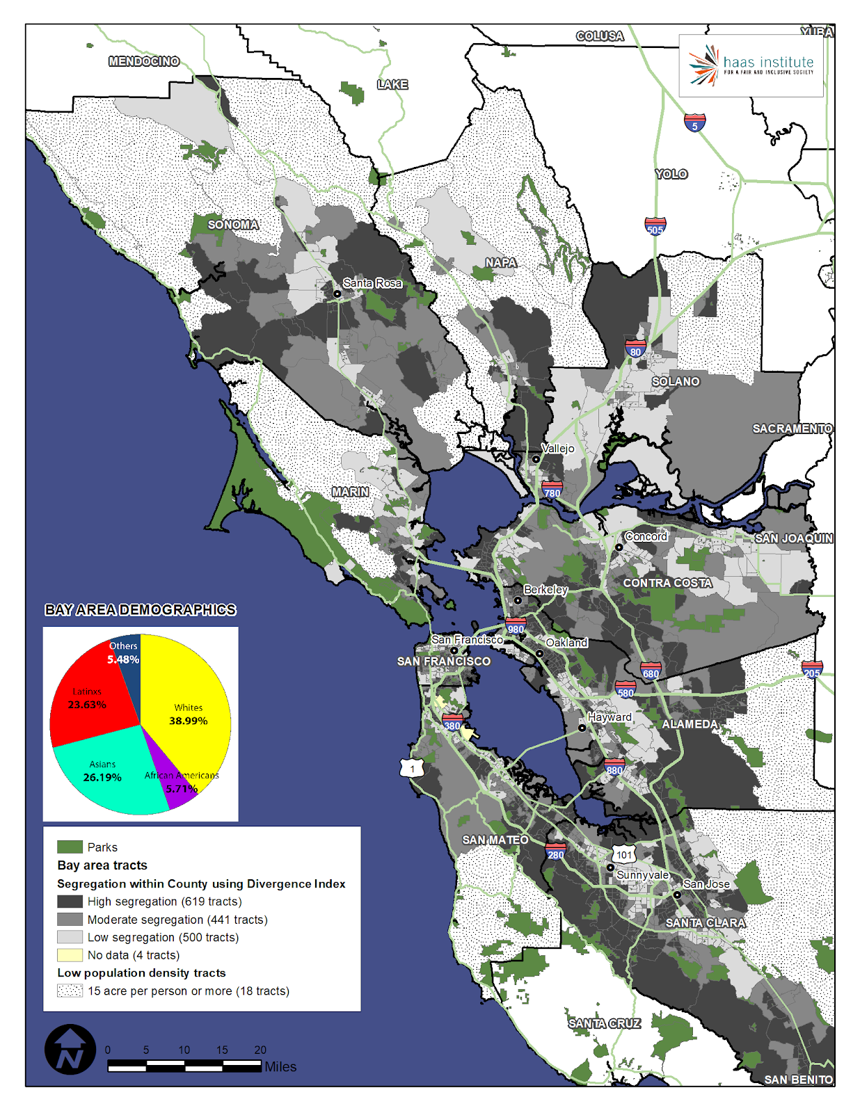
If your intuition about segregation is that “white flight” never ended—wealthier white families left cities to form a “white noose” of smaller, affluent suburbs with exclusive school districts—your intuition is correct. Indeed, Menendian and Gambhir find that white people in the Bay Area are the most “segregated” demographic in the region. While that may sound odd at first, the data bears it out: “Although whites are just under 40 percent of the population of the Bay Area, 184 census tracts (of 1582) are more than 75 percent white, 359 tracts are more than 66 percent white, and 663 tracts are more than 50 percent white.”
Without numbers, that means: “whites…have less exposure to members of other racial groups than any other racial group has to each other.” White suburbs and ethnic enclaves are two sides of the same coin.
Oh, and about those suburbs? It turns out that white-concentrated neighborhoods are more prevalent in smaller municipalities, which strongly correlates with the persistent segregation of public schools. As the researchers note, “although a majority of the most highly segregated neighborhoods for people of color are found in the largest cities in the region, the most segregated white neighborhoods are in small or mid-sized cities.” Meanwhile, the region’s largest cities such as Oakland, San Jose, and San Francisco are more diverse, but have the most segregated minority enclaves. For every Hunter’s Point and East Oakland, there’s an opposite and unequal Piedmont, Atherton, and Walnut Creek.
As for more rural counties in the region, this pattern has some interesting wrinkles. “Although Sonoma is the ‘whitest’ county in the Bay Area,” Menendian and Gambhir note, “five of the 10 most segregated census tracts in the entire Bay Area for whites are located in Marin County”—not surprising for a county that was found out of compliance with Fair Housing regulations in 2011.
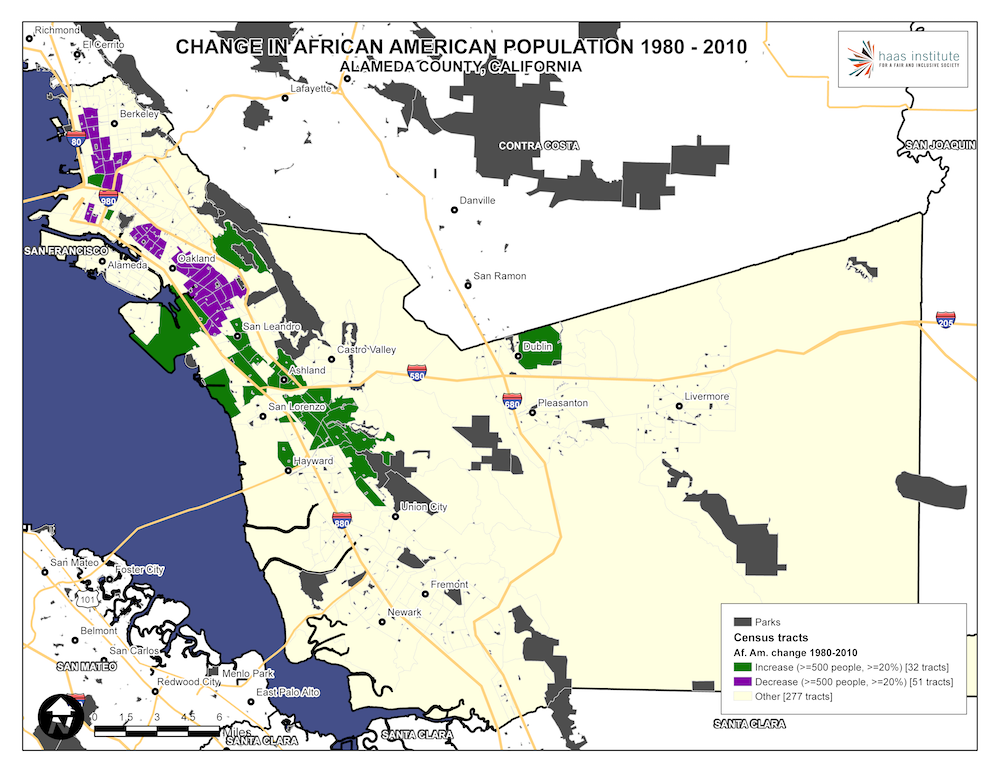
Part 2 of this series outlines how current patterns of segregation reflect persistent historical inequities, with detailed mappings of five racial categories. More importantly, the researchers mapped migration patterns to unpack the paradoxical stubbornness of segregation in the face of instability. From 1970 to 2010, the black population dropped from 13.8 percent to 7 percent, while the city grew overall. As twin forces of redevelopment and local exclusion displaced black communities in the 60s and 70s while keeping them out of whiter neighborhoods, the region’s historically black neighborhoods saw a diluted concentration of black residents, and a movement out to the outer reaches of the region in eastern Contra Costa and southern Solano counties.
This map of Alameda County illustrates a sample of that change:
We’ll be updating this newsletter soon with the subsequent parts of this series, which cover new methodologies and policy implications of the region’s racial and spatial injustices.